Page 1 of 1
What I've been up to....
Posted: Sat Feb 14, 2009 6:21 pm
by XMENPorsche
Posted: Sat Feb 14, 2009 7:55 pm
by XMEN Gambit
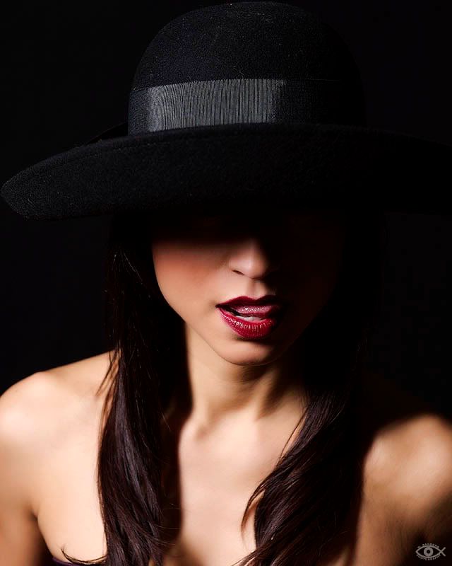
I really like the hat concept! Not sure whether her eyes should be open or closed. Would like to see several different mouth expressions there. Could also do interesting things with really really vivid or odd-colored lipstick. If you want to draw the eye to the mouth better, probably should remove some light from the lower part of the frame.
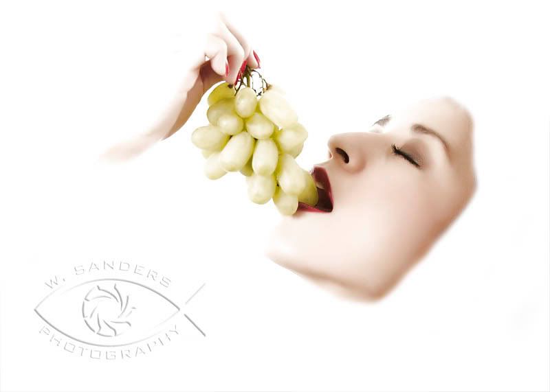
Also like the face w/grapes thing. My biggest problem with it is the way the back (lower right) edge of the face is cut off. The way the wrist fades out is great, though the missing knuckles maybe bothers me a bit. Not sure if the best way would be a gradual fade or an even cutoff arc or both/neither.
Posted: Sat Feb 14, 2009 11:45 pm
by XMENPorsche
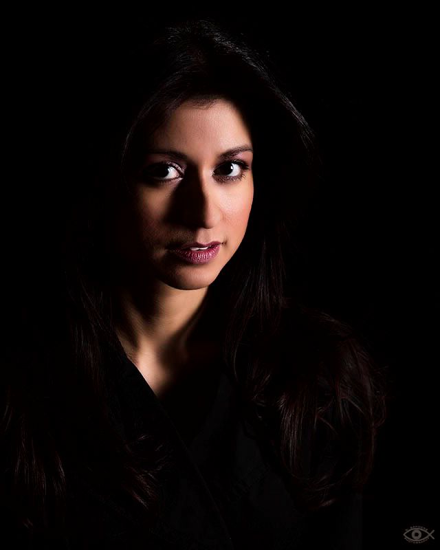
To be honest, my favorite one is the shot with the Rembrandt lighting (2nd one from the bottom).
Hard to believe that Natalie is 36 years old.
As for the hat concept, I tried to shoot it in such a way as to leave the eyes in the shadow, hence it would not matter if her eyes were open or closed. I thought about changing the lipstick color but decided that I like it as is.
As for the last one, let's just say that it's a work in progress. I like the overall concept but I think I might play with it a bit more.
Thanks for the comments.
Posted: Sun Feb 15, 2009 1:39 pm
by XMEN Gambit
On the hat photo, I mentioned the eyes because I can sorta see them, just enough to make me study that area. I agree, they should be hidden.
That 2nd from bottom, the lighting is admittedly dramatic. I assume a single softbox there on the right judging from the nice catchlights. I don't recognize anything as being "wrong" to critique and it also doesn't particularly grab me. (Which may be due to her expression, or maybe just my issue, not yours.

) Hence lack of commentary.
Posted: Sun Feb 15, 2009 9:57 pm
by BlackRider
I can't really comment on portraiture, but I like the one w/ the hat the most... though I'm really distracted by the fuzzies all over the hat. (Things like that drive me so crazy that there are times when I was going to photograph something but I spent all of my available time trying to clean it up... and so the photo never got taken.)
Good job on all of them though!