Team Picture - A little bit different
Moderator: Moderators
-
XMENPorsche
- Inmate
- Posts: 536
- Joined: Wed Nov 17, 1999 10:41 am
Team Picture - A little bit different
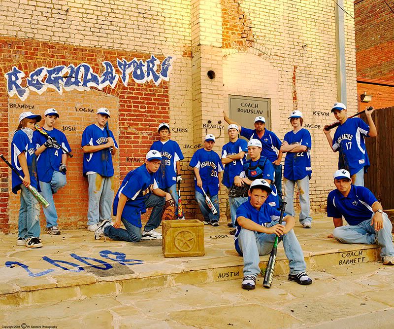
I've had this concept for a team photo of my son's baseball team since about January. I wanted to stay away from the standard cheesy team pic. I was finally able to get the kids together a few weeks ago. I'm pretty happy with the results. Comments?
-
Spinning Hat

- Inmate
- Posts: 2564
- Joined: Wed Jun 07, 2000 10:06 am
- Location: Minneapolis, MN
- Contact:
I like it. The blue of the jersey's pop from the background, but the coach's hat cocked sideways and the box next to the pitcher kinda throws me off, but the rest of it is great. 

"Never, Never, Never quit." - Winston Churchill
"Men don't like to cuddle. They only cuddle if it leads to.. You know.. Lower cuddling." - Ray Romano
"Tell your wife that she looks pretty, even if she looks like a dump truck." - Ricky, age 10
-
XMEN Gambit

- Site Admin
- Posts: 4122
- Joined: Thu Nov 18, 1999 12:00 am
I really like it. A lot. Great concept!
You shot at 34 mm... I forget, is the D3 a full-frame? Looks like a little bit of a wide-angle effect that I wouldn't expect on a C-size sensor at that length. Not a criticism, just noticing. The difference in size between the front row (Austin) and the back row (Coach directly behind) is not usual in a team pic.
The things that strike me as not quite perfect (if you want me to pick nits) are...
The lighting looks a little funny to me on Austin's face. Did you use any lighting? Exif says no flash. Reflector(s) might have helped?
A little trouble with the brick texture coming through the lettering, particularly on the "Regulators" name. It's obvious you've worked on it and I'm not sure the casual observer would notice a problem or mind if they did, but given the stuff I used to do in Photoshop when I had time my eyes went there almost immediately. I'm guessing you mostly used some transparency to get the brick to show through? And the top of the "s" looks funny because the brick is lighter under it.
I like the box. Not sure about the placement one way or another, to comment on Hat's comment. But I think the logo on it is a little too far right.
Oh, and you could probably crop some off the top and bottom. Guess it depends on the proportions you're looking for, since you sure can't off the sides.

-
XMEN Ashaman DTM
- Inmate
- Posts: 2369
- Joined: Mon Oct 02, 2000 12:09 am
- Location: Silverdale, WA
I absolutely love the concept Porsche. I think if you played with the contrast of the lettering to the background it might show better for the people that haven't seen artwork/images like this before. One nitpick: the wire seen in the upper right corner doesn't show continuity across the corner of the frame. If the stuff on the right is to have the correct perspective, it's got to be fixed or removed.
I like it a lot though.
I'm not a photo geek, so I can't comment more than that.
I like it a lot though.
I'm not a photo geek, so I can't comment more than that.
-
XMENPorsche
- Inmate
- Posts: 536
- Joined: Wed Nov 17, 1999 10:41 am
Wow - thanks for the feedback, folks! Let's see if I can answer some questions.
Hat - not much I could do about the coach's hat. He wore it the way he wanted, regardless of what several of us said. No biggie.
The box.... It was already there an I really didn't want to move it. Most people have liked it, some haven't cared to much for it. I could have went either way, but since it wasn't my property that I was shooting on I didn't want to move things around.
Gambit - Yes, the D3 is full frame. I used my 28-70 f/2.8 on this so that I could get a wider FOV.
The lighting.... All natural lighting. No flash or reflector used. I considered a reflector but I would not have been able to get it close enough to the players to make any difference.
The grafitti.... I had a friend help me with that a bit. I like the way that we were able to get the brick texture to show through, but you're right in that it makes the "S" a bit harder to read. Might have to play with it a bit more.
Cropping.... Can't really do much more with it since I'm constrained by the 5x4 proportions that I had to use. That's probably my biggest nit with the whole image is the negative space at the top and bottom.
Asha - good catch on the wire. I missed that one and will edit it out later.
Again, thanks for the feedback. VERY valuable info.